Reduce website load time by serving images in the next generation file formats
Images are the most easy to overlook when evaluating website load time performance. Large images seem like the necessity of modern web design. Something we cannot compromise on and just need to accept as a fixed cost of the creative vision. Who doesn't love a photo of a valley in the Amazon forest covering the entire background of a landing page. How else could you convey the simplicity, thoughtfulness and world changing impact of the software you hacked together over the weekend to manage todo items. Jokes aside, images are easy to overlook, but there are techniques to reduce image size and improve web page load performance without losing friends in the design department. One of which you will learn by the end of this article.
Build empathy
Let's first start by building some empathy with the end user. I have prepared a very simple webpage which includes one large photo of a windflower (Photo Credit: me). Follow the instructions in the example page and you will experience how slowly the image loads when simulating a “Fast 3G” network conditions. Now imagine the first load experience for a person who opens a website with a few images like this. That’s pretty bad and there is a big chance that the user will give up on waiting and leave the website. “3G? Everyone has 4G already” one might argue. And you might be right for the most developed world in big cities, but at the same time spend a few minutes visiting your top 5 websites and see how many images above 200KB are loaded. I just did that and could count 7 on average. Ouch!
Solutions
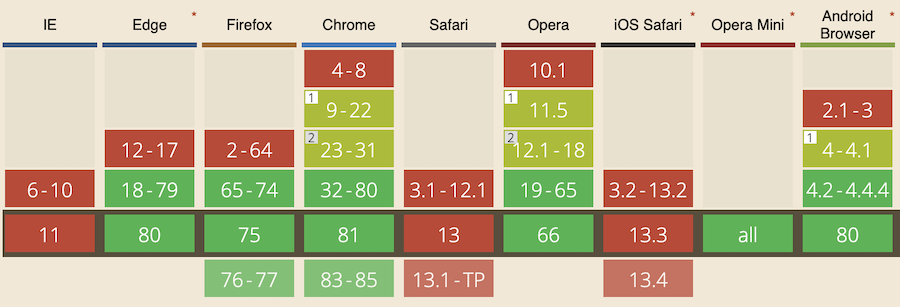
“Bring me solutions, not problems”. What can we do about the large image file size without compromising on the quality of the image? You see, tech giants have already been thinking about this, because it costs a lot of money to push large images through the pipes of the internet once your website reaches the scale of Google, Microsoft, Apple and so on. So, in this case we can choose to stand on the shoulders of giants and pick a next generation image format from Google called WebP. I also want to mention that there are other image formats designed for superior compression like JPEG 2000 and JPEG XR, but we will be focusing on WebP since it is the most widely supported in the modern browsers.

WebP
WebP format is designed for the web and employs clever compression techniques which allows to reduce image size by losing some of the image data which is not noticable by the end user. You can choose how much quality you want to keep when converting images to WebP and land on the quality vs size balance which suits your use-case best. I have created a second example page where you can compare the loading experience using the WebP image version with 80% quality. Pay attention to both the loading speed and if you can spot any visible quality differences. Honestly, I can’t. Going from 416KB to 133KB is HUGE and justifies some extra time needed to setup image conversion pipeline and adding a bit of extra HTML markup to serve from two image sources.
Let's get down to HTML
In order to use WebP images and have a fallback for browsers which do not support this format we will be using a picture HTML element. Picture element allows us to provide alternative image sources and let the browser decide which one is the most suited. In this case we are only interested in WebP support, but in later articles I will also cover how to select a different image source based on screen size and density.
<picture>
    <source srcset="windflower.webp" type="image/webp">
    <img src="windflower.jpg" width="400" alt="Sub optimal image">
</picture>
Conclusion
Now you know how to get WebP images working for you. I would recommend starting with the largest images on your website to see how much gain you can get by providing an alternative WebP image source. Do a technical spike, measure and apply. Never blindly change your technical stack just because some guy recommended it on the internet.
