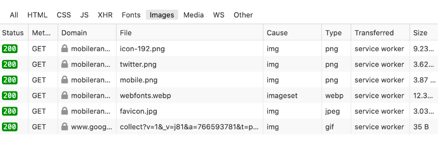
Delay loading offscreen images to improve mobile website performance
Images can have a big performance impact on your mobile website. Some of this impact can be alleviated by encoding images in the next generation file formats like WebP. But if a web page has 30 large images, then no matter how much compression next gen formats can provide, mobile browsers will still need to make 30 network calls and fetch data. And the more network calls are made over slow connection, the longer it will take for the web page to fully load or in the worst case render.
Mobile device screens usually can fit only part of the website. All other content goes beyond the fold and can only be reached by scrolling. The time spent loading images, scripts and styles for content which visitors cannot see initially is unproductive. Luckily, unproductive work is a common enough problem in Computer Science that it has a well understood solution: delay doing work until it is needed. It is usually solved by delayed initialization, sometimes also called lazy initialization. How can images on a website be lazy?
If loading resources beyond the page fold is unproductive, then every image, which is not initially visible by the visitor, should not be loaded. To make this rule more generic, it can be formulated like this: images should only load when they come into the visible area of the browser screen (viewport). Previously, JavaScript solutions were the only way to achieve this, but it's such a common problem that lazy image loading is now natively supported in modern browsers. Chrome, Edge, Opera and Firefox support lazy property for images and iframes. Safari and IE users, sorry, look for a more modern browser.
Making images load lazily is extremely easy in modern browsers. Just add loading=”lazy” and you are done. Browsers will automatically figure out when an image comes into the viewport and start loading it.
<img src="example.png" loading="lazy">
