Load different images based on screen size
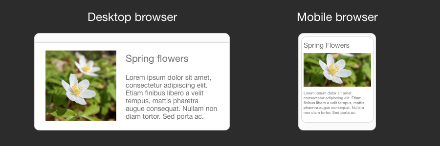
Blurred images on high density displays (Retina) or unnecessarily large images on small mobile screens are two extremes which can significantly hurt your website user experience and performance.
We have covered how to utilize next generation image formats to improve web page loading time previously. This time, let’s expand our knowledge of picture HTML element and how it can be used to serve different images based on device screen size. Continue reading...


