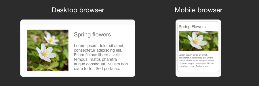
Load different images based on screen size
Blurred images on high density displays (Retina) or unnecessarily large images on small mobile screens are two extremes which can significantly hurt your website user experience and performance.
We have covered how to utilize next generation image formats to improve web page loading time previously. This time, let’s expand our knowledge of picture HTML element and how it can be used to serve different images based on device screen size.
Load larger image on high DPI displays
You might be completely unaware that your website visitors are getting sub-optimal experience on high DPI screens. First action here is to make sure that you are collecting device pixel ratio analytics. You can read device pixel ratio in JavaScript by accessing window.devicePixelRatio property. This will help to know your visitors better and decide if you should generate images at higher scale.
Once you know if you have visitors with high pixel density screens, you need to make a decision if serving larger images and taking a slight performance hit is worth the improved User Experience. Most of the time the answer is yes, because you can find different ways to optimize website performance and there are only a few ways to work around blurry images.
On the HTML side, detecting 2x pixel ratio and loading twice as big an image is relatively easy. You only need to provide srcset property on an image tag and qualify a condition when the different image should be selected. I say relatively easy, because changes to your content production workflow to produce assets at 2x scale will probably require more work.
<img srcset="image.png, image-2x.png 2x" src="image.png" >
Load different size image depending on screen resolution
When website visitors have a device with lower resolution (mobile/tablet), it makes sense to also serve smaller resolution images. Visitors will not notice a difference in image quality and at the same time will get better performance. This optimization also helps to save bandwidth on the web server.
Specific screen resolution breakpoints should be derived from real world usage analytics. Breakpoints will be hardcoded in HTML and might not always result in the most optimal image served, but as long as it works in most of the cases it is worth the effort. Dynamically resizing images on the server side is also possible, but would result in increased CPU usage on the backend for questionable gains on the frontend.
For example, imagine that you want to serve a smaller version of an image if browser screen resolution is lower than 600 pixels. You can achieve this by using a picture source set with a media query attribute.
<picture>
  <source media="(max-width: 599px)" srcset="image_small.png">
  <source media="(min-width: 600px)" srcset="image.png">
  <img src="image.png">
</picture>
Combining everything together
Picture source media and srcset attributes can be combined together to achieve ultimate responsive strategy. Notice the addition of a high device pixel ratio image for screens with resolution above 600px.
<picture>
  <source media="(max-width: 599px)" srcset="image_small.png">
  <source media="(min-width: 600px)" srcset="image.png, image-2x.png 2x">
  <img src="image.png">
</picture>
A lot more to learn
We have only scratched the surface of responsive images and covered only the most commonly occurring problems. To learn more, read an excellent article from Mozilla about responsive images. Also it’s very important to get to know your visitors, otherwise you will be optimizing for edge cases while you could be spending more time on creating value and better User Experience for your actual visitors.
